Polymer 1.0–Customize Style of existing components
Polymer 1.0 comes with plenty of available components, especially if you are going to implement Material Design. The only problem is that they implement the default style which usually doesn’t fit with mine.
In this post I want to show you multiple options of customizing a Polymer component together with the help of Polymer 1.0 documentation, available online.
Override the Style using
Let’s start by preparing a Polymer project, like explained in my previous tutorial, and we add a simple Toolbar with two icons:
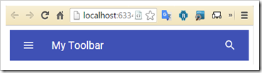
And this is my markup to import and create a Toolbar with two paper-icon-buttons:
<!-- Toolbar element -->
<a href="bower_components/paper-icon-button/paper-icon-button.html" rel="import">
<a href="bower_components/iron-icons/iron-icons.html" rel="import">
<a href="bower_components/paper-toolbar/paper-toolbar.html" rel="import">

<!-- Toolbar -->
<paper-toolbar>
   <paper-icon-button icon="menu"></paper-icon-button>
      <div class="title">My Toolbar</div>
   <paper-icon-button icon="search"></paper-icon-button>
</paper-toolbar>
Now, if I want to modify the background color of the Toolbar, first, I need to head to the paper-toolbar documentation here and find out how I can do that.
The CSS property that we want to override in our case is called –paper-toolbar-background.
Inside the HEAD tag of your page, you can create a new

It is important to use the attribute is=”custom-style” which will inform Polymer that your style is going to override the normal Polymer CSS. Also, the tag style must be inside the <HEAD> tag otherwise it won’t work because it will be loaded too late by polymer.
Now, let’s say that this is too invasive for you and you want to override the toolbar background only for a specific scenario, for example, only for a certain webpage. We know that for the specific webpage the toolbar must be pink, so we can identify the toolbar id with a “pink” name:
</pre> With this statement you are going to have all toolbars in your project with a background color equals to #FF6D00 except the one with id equals to **pink-toolbar** which will have a background color equals to #e91e63. [ ](http://blog.raffaeu.com/wp-content/uploads/2016/02/image-9.png) ## Create a custom style component Now, the best feature of Polymer is the capability of loading _components_, it is really helpful. Think about this, you have deployed an application which should be capable to load custom _themes_ based on the user logged in, so what about having a custom CSS component which will override all your UX settings? Well with Polymer 1.0 this is possible and is quite straight forward. First of all, we need to create a custom component which we will call “raf-theme” as following: [
](http://blog.raffaeu.com/wp-content/uploads/2016/02/image-10.png) Then I am going to declare my DOM inside the page “raf-theme.html” as following:
And now I can just use my custom theme as a normal Polymer component in the following way:
In my own opinion, the best way is to have multiple dom-element into your “theme” component, one per each part of the UX. For example inside raf-theme I have the following elements: * raf-toolbar-theme * raf-drawer-theme * raf-form-theme and so on and I declare each theme only when I need it, plus everything is modularize so for me it’s easier to find a specific CSS property of a specific component and override it.